Any other goodies?
Even in a multi-part review, it's almost impossible to cover every perceivable feature of a Windows operating system, but there are a few new niceties that we'd like to shed a little light on.
For those making use of multiple displays, a new keyboard shortcut (Windows Key + P) simplifies the task of switching between display modes.
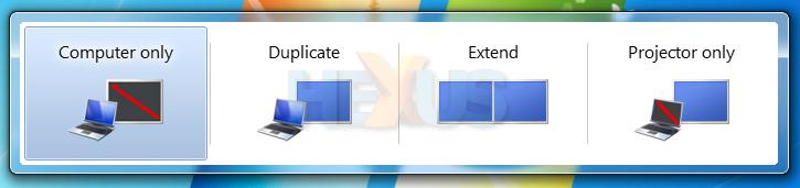
Available options include computer only, duplicate (mirror), extend and projector (or external display) only.
Gadgets, another feature that first debuted in Windows Vista, has also been revamped for 7. This time around, the Sidebar has gone the way of the dodo, and gadgets are allowed to roam freely anywhere on the desktop - exactly how it should have been in the first place.
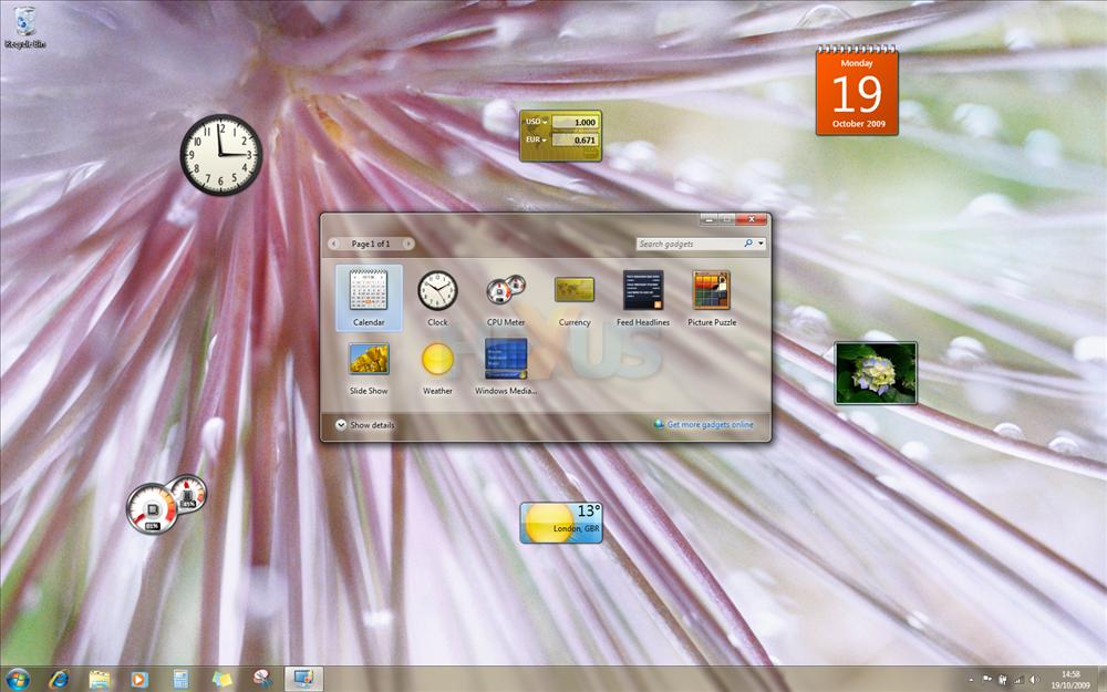
Despite the improved functionality, however, the default bundle of pre-installed gadgets is still lacklustre, with only one new addition, a gadget for Windows Media Centre.
Herein lies a problem, as Microsoft's basic bundle puts the onus on third-party developers to deliver compelling gadgets. Sadly, compelling, or even useful gadgets, remain few and far between. Microsoft's online gallery - launched a couple of years ago - remains lacking in terms of essential gadgets. We'd like to see Microsoft encourage the development of better gadgets, and it might need to start by offering a greater set of in-house-designed gadgets for proprietary Microsoft technologies such as Xbox and Zune.
The potential for gadgets is there, but it's still some way from being fully realised.
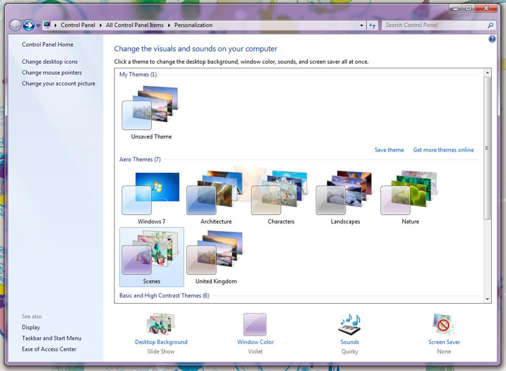
If you're struggling to customise your desktop with gadgets, however, you can always resort to themes; they're making a comeback in Windows 7.
Microsoft includes seven (coincidence?) aero themes as standard; Windows 7; Architecture; Characters; Landscapes; Nature; Scenes and another country-specific theme - United Kingdom, in our case. Each is accompanied by a unique sound scheme, and a specific window colour.
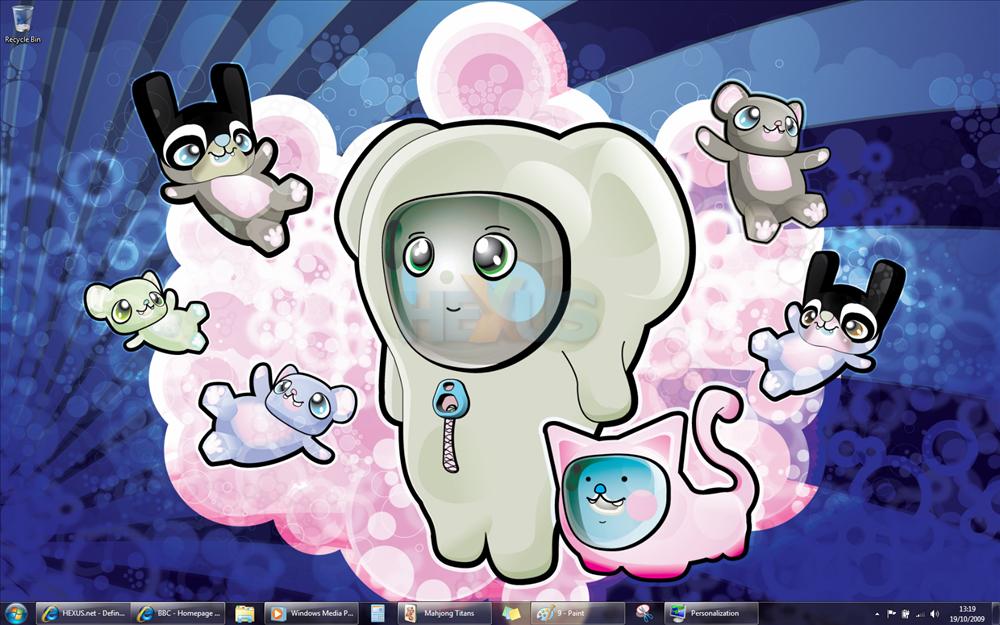
It's a decent selection of bundled themes, and what's interesting is Microsoft's choice of wallpapers. The entire library of Vista wallpapers has been tossed out. In comes a mixed variety that should appeal to a wider range of users. Take for example this wallpaper from the Characters theme; we can't recall a Windows operating system ever looking so cute, colourful and interesting.
What's useful is that users are also able to create and share their own themes, and there's, finally, built-in support for rotating wallpapers. Users can choose to rotate their background at set intervals ranging from 10sec to one day, and there's also an option to pause the desktop slide show when on battery power.
It's even possible to power desktop slide shows from an RSS feed - although that requires a little know-how on the part of the end-user. For the less technical customer, Microsoft's desktop slide show implementation is missing one obvious feature - when choosing a folder of wallpapers, it isn't possible to include sub-folders, too. A minor, yet annoying oversight.
In summary, the Windows 7 user interface is a vast improvement when compared to Vista for two key reasons. The first is that functionality has been expanded via the introduction of new technologies such as a revamped Taskbar and Windows Aero. Secondly, and arguably more importantly, the interface, for the most part, is notably more snappy and quicker to respond.
Even on a mid-range Dell notebook dating back to 2007, Windows 7 feels like a new lease of life. It's visually the best-looking Windows operating system we've laid our eyes on, and despite minor niggles, its all-round responsiveness makes it a pleasure to use.
HEXUS: Windows 7 review index |
||||||