Ever wondered what other designs Microsoft had in mind before it settled on Windows Phone 7 Series' Metro interface?
The software giant has this week provided a glimpse of pre-Metro concepts at the MIX developer conference in Las Vegas, showing what could have been.
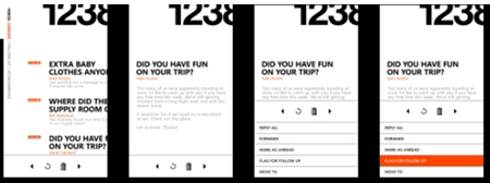
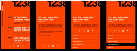
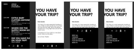
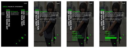
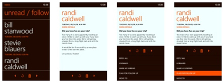
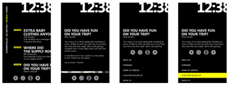
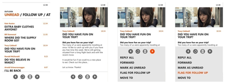
It's unusual to see designs that were ultimately rejected, but the concepts provide an idea of what Microsoft has been hoping to achieve.
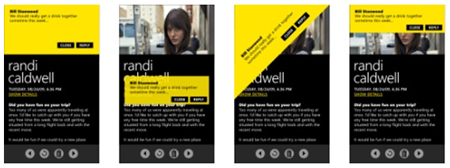
Hoping for a look and feel that's "modern and clean" and "entirely authentic", the software giant set itself a quartet of key principles; clean, light, open and fast.
In keeping with those principles, Microsoft claims it has tried to "do a lot with very little" by using a "clear, straightforward information design".
Helping deliver its simplistic approach is a clever use of two primary elements; colour and typography. As can be seen throughout Microsoft's concepts, the goal has always been to create an interface hierarchy emphasised by colour, with ultra-crisp typography bringing depth to the experience with the use of weight and scale.
Microsoft reckons the end result - Metro - will "delight" users, and we're admittedly eager to get our hands on it. What's always interesting is just how different Windows Phone 7 Series is in comparison to everything that came before it in the Windows Mobile space. Check out a handful of other radical concept designs below, and feel free to let us know what you think of the Metro user interface - both the final and early concept versions - in the HEXUS.community forums.
Source: Channel 9, via: istartedsomething.com