


A New Home
The Windows desktop. This is the place that millions of PC users call home, and let's not beat around the bush, when you first use the desktop in Windows 8, it feels horrible.
There's no Start menu. It's like getting to the front door and being unable to find your keys. The sensation is made all the more strange when you eventually come to realise that the Windows 8 desktop is, for the most part, an improved version of the Windows 7 equivalent.
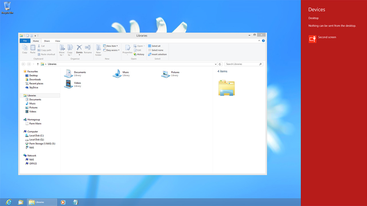
It runs on the same hardware (only quicker); the jump-list-enabled taskbar's still here (but it's better thanks to improved multi-monitor support); built-in libraries continue to make light work of file management (aided by a revamped file explorer); the task manager is better than ever; a cloud connection keeps desktop settings in sync across devices; anti-virus is built in as standard, and even basic tasks such as file copying work better in Windows 8 than they did in Windows 7.
The improvements are numerous, so why the initial disdain?
What's Worse
Windows 8 has a nasty habit of rubbing users the wrong way, and that's because the desktop doesn't behave the way you'd expect it to.
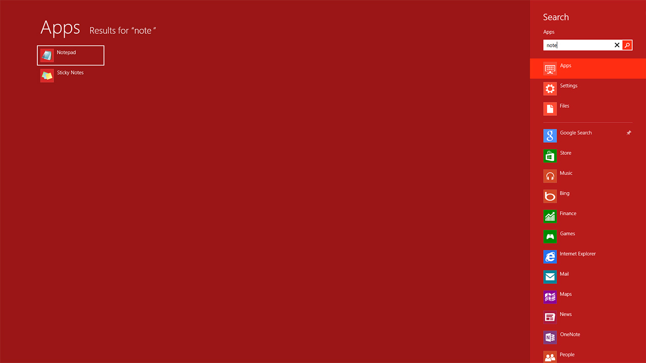
Windows users are accustomed to living inside this environment, opening as many programs as they so desire without having to leave. With Windows 8, the desktop is best described as another app inside the Modern UI. That live-tiled Start screen is in fact the centre of attention, and even if you intend on setting up shop on the desktop, you'll find yourself having to resort to the Modern UI more often than not.
Want to launch a new program? Bring up the Start screen. Want to search for a file or document? Bring up the Start screen. This to-and-fro experience that feels jarring and disjointed, and though the behaviour is similar to the Start menu of old, it's the Modern UI's full-screen fixation that at first throws the user; you might simply want to find and open notepad while working on something else, and having to momentarily give up your entire screen feels wasteful.
The inability for all-things Modern to run in anything other than full-screen mode greatly reduces the value of almost every Windows Store app; they can't be used/viewed at the same time as your desktop programs on a single display.
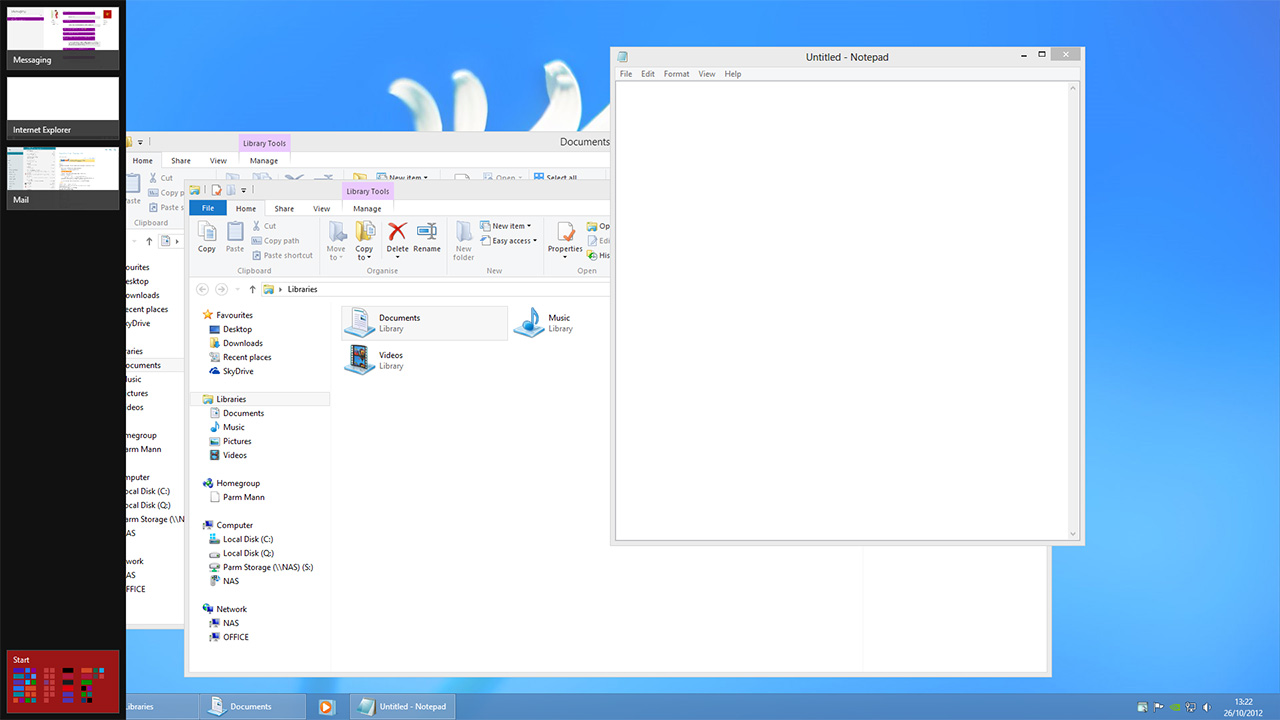
Here's an example; you're knee-deep in an Excel spreadsheet and a cute notification appears in the top-right-hand corner, indicating an instant message from a friend or colleague. You click it, and bam, the Messaging app takes over the entire screen. Apps that serve such basic functions shouldn't engulf everything else, and this frustrating full-screen takeover applies to any app downloaded from the Windows Store. It's counter-productive when you're in the desktop doing what the desktop does best: work.
These limitations are enough to turn power users away from the various Windows Store apps, resulting in duplication based on usage scenario. On my own PC, I use the Mail app when I'm a casual user, but when I'm working I use a desktop program (Windows Live Mail) that's more effective and able to run in windowed mode. This desire to have a simple app for everyday use and a powerful program for productivity is a problem, and until Microsoft can bridge the gap between light apps and fully-functional programs, we can't see any solution but to have one of each.
And there are other areas in which the Modern UI manages to interfere. Moving the mouse to the top-right of the screen brings up a Charms bar that serves little purpose in the desktop environment, and if any apps are open, moving the mouse to the top-left corner brings up the switcher; which serves only to obstruct the user from closing full-screen desktop programs using the old double-click trick.
 |
 |
 |
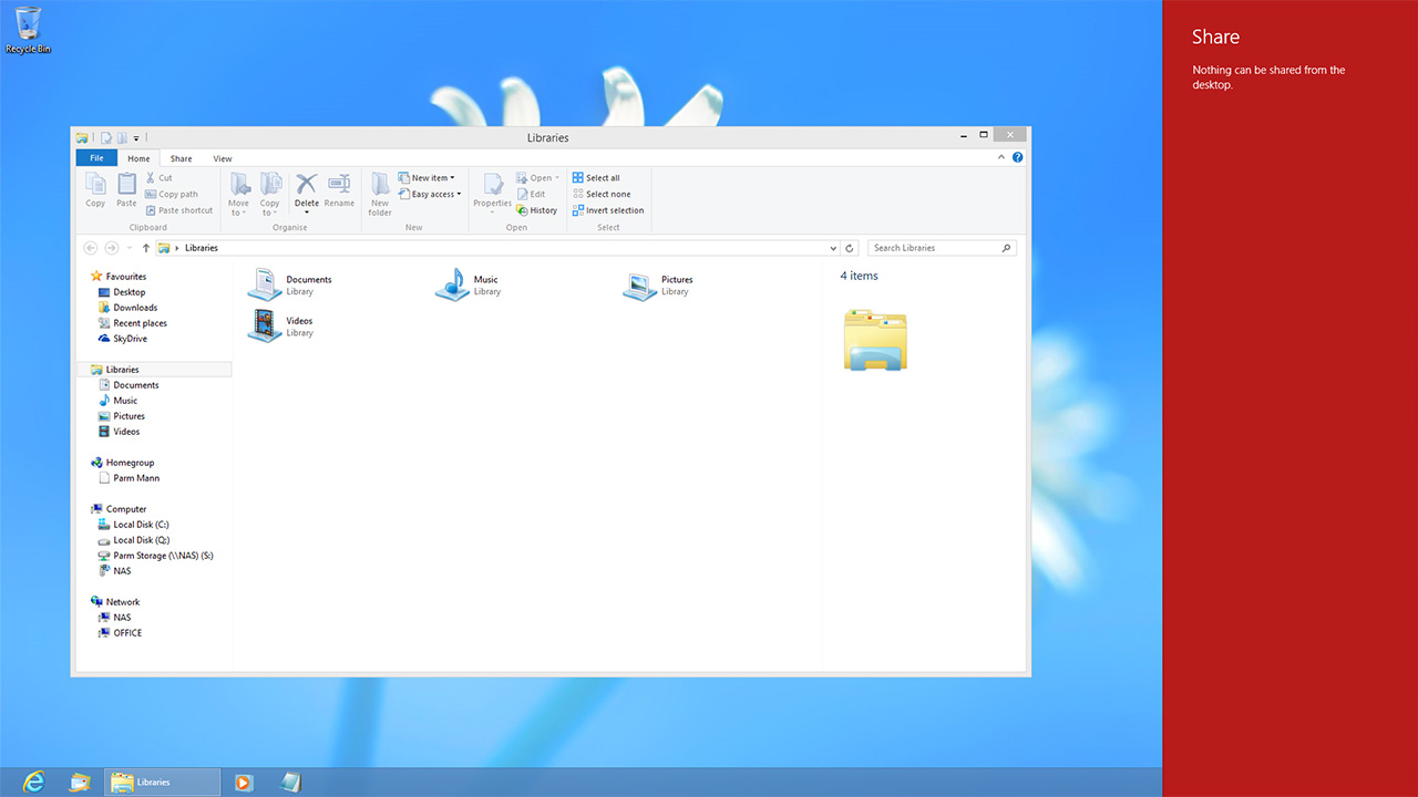
The key components in navigating the Modern UI are almost entirely pointless on the desktop. Want to Share something from a desktop program? The Share charm won't let you. Want to send something from the desktop to another device such as a printer? The Devices charm won't let you. And if you're thinking the App switcher would be a good alternative to Alt + Tab, think again, it only lets you switch between Windows Store apps; desktop programs aren't listed at all.
The rumours you've read are right; Windows 8's Modern UI, by its very essence, isn't a great fit for the desktop power user with a keyboard and mouse. And these users may feel further aggrieved at the loss of certain features. In addition to the Start menu getting the axe, Windows 8 doesn't support Desktop Gadgets (which admittedly never took off), the Aero Glass theme has been cut in favour of solid colours that tie in with the Modern UI, and support for DVD playback has been dropped due to licensing costs. Microsoft's penny-pinching on the DVD front also has a knock-on effect on Windows Media Center - it's now a paid-for optional extra for users of Windows 8 Pro, though Microsoft has attempted to soften the blow by offering the Media Center Pack as a free upgrade until January 31, 2013.
But the implications of these cuts and changes have been exaggerated. Desktop Gadgets officially sucked (Live Tiles have more to offer going forward), physical media is losing/has lost the war against streaming content, Media Center never amounted to anything more than a niche pet project, and the new Start experience isn't where desktop users will spend their time. Get past the reimagined, full-screen Start menu (which, we should add, is still an excellent launch and search utility on any device) and the underlying desktop is a lot like Windows 7.


