


Running the numbers
A monitor review based on descriptive visual analysis will always have the underlying problem of subjectivity; assessments of panel quality will vary from user to user depending on their normative expectations. To get around this we’re deploying Datacolor’s Spyder 4 Elite professional monitor analyser to return a quantitative assessment of display quality.
We also make use of the Leo Bodnar video signal input lag tester which allows us to test the combined input latency of a specific monitor at the 1080p resolution with 60Hz operation only (a limitation of the testing equipment).
These numerical results, we feel, add extra utility to our reviews allowing us to more accurately benchmark the following display characteristics:
- Colour gamut relative to sRGB and AdobeRGB industry standards
- Brightness levels and contrast ratios
- Colour uniformity
- Luminance uniformity
- Colour accuracy (Delta-E)
- Input latency
Gamut
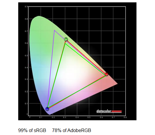
The B2783QSU does a decent enough job with respect to colour gamut. This is not a professional monitor where an expanded gamut is a must, so 99 per cent of the regular sRGB and 78 per cent of AdobeRGB is exactly what we'd expect. The range of colours feels adequate enough when looking at pictures or gaming. It's only by putting a professional monitor side by side do we see minor deficiencies.
Colour accuracy
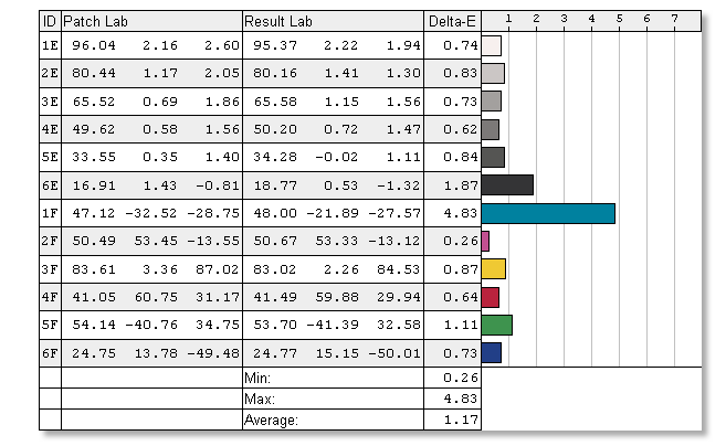
The Delta-E figure corresponds to how close the displayed colours match up with real life. A lower Delta-E is better, meaning closer reproduction, and any figure below 2 is considered decent. Once calibrated the B2783QSU is very, very good, coming in at 1.17, or about as good as we've seen from a regular monitor ostensibly aimed at gaming.
Colours therefore feel natural and to some extent muted compared to the overly-bright reproduction of other monitors. This is certainly a strong point for those looking for an all-round screen. Gamma, incidentally, was measured at 2.3, which is also considered to be good.
Colour uniformity
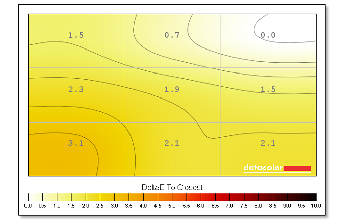
Having great colours is only one part of the equation; uniformity across the screen is also important. We're glad to see there isn't a a lot of variation from nine different measurement points. The bottom-left corner has the greatest, but putting up a screen-encompassing block of colour in Photoshop doesn't cause us to question the uniformity from an eyeball point of view.
Luminance uniformity
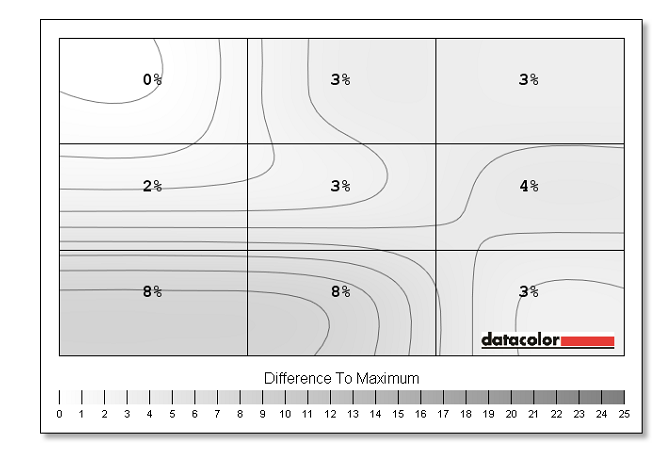
What about luminance? Some screens tend to be overly bright in one area and somewhat dark in another. Again, the B2783QSU fares well, with a maximum deviance of eight per cent at the bottom - this is a best-to-worst scenario. This is why colours look even and 'flat'. Good job by iiyama on the quality of the TN panel.
Brightness and white point
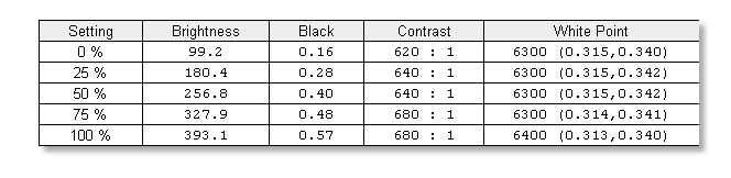
We've certainly seen blacker blacks on IPS panels but they're acceptable if you have some ambient lighting around the screen. They don't feel completely inky to the eye no matter how you tune the variables. Are they good enough? The answer is yes. There's a decent amount of brightness on tap if you pump it above 50 per cent while contrast is also reasonable, if not brilliant. We recommend a 40-60 per cent brightness in a well-lit room.
The preferred white point for monitors is D65, or 6500K, which gives off a minor blue-ish hue due to the natural brightness in the colour temperature. The screen gets pretty close to this preset at all brightness levels, hovering between 6300K and 6500K.
The tests show the B2783QSU is a more than competent performer for day-to-day work. Colours are accurate, brightness is good and there's a decent amount of uniformity and luminance across the screen.
Input lag and power consumption
We measured the consumption at the mains at 23W when displaying a back screen and 27W for a white screen with 50 per cent brightness. Input lag, at 1080p, was 13ms, which is better than average for TN-based panels.


