facebook rss twitter

Microsoft bringing ribbon interface to Windows 8 Explorer

by Parm Mann on 4 April 2011, 10:05

Tags: Windows 8, Microsoft (NASDAQ:MSFT)

Quick Link: HEXUS.net/qa5fm

Add to My Vault: x

Microsoft is toying with the idea of a refreshed user interface for its next major operating system, Windows 8.

Pre-beta screenshots of Microsoft's software have surfaced on the web, showing one of the operating system's integral components - Windows Explorer - with a ribbon interface in place of the tried-and-trusted toolbar.

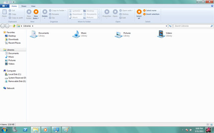
The ribbon, previously described by Microsoft as a "modern way to help users find, understand, and use commands efficiently and directly with a minimum number of clicks", is currently employed by the company's Office 2010 software suite and features in a handful of existing Windows 7 applications - including Paint and WordPad.

Consumer reaction to the re-jigged menus has been mixed, but Microsoft looks set to make the ribbon a de-facto standard in the Windows 8 experience.

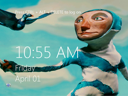
The screenshots, depicting an early implementation of the tabbed Windows Explorer interface, have also hinted at tight integration with other Microsoft services. Menu options titled "Sync" and "Web Sharing" suggest access to Windows Live Mesh and Windows Live SkyDrive from within the Explorer application, and a new-look Windows 8 welcome screen bears close resemblance to the lock screen featured on Microsoft's mobile platform, Windows Phone 7.


HEXUS Forums :: 50 Comments

Login with Forum Account

Don't have an account? Register today!
Oh dear…

“Ribbon user experience” or rather “If you look for something it won't be on the bloody ribbon so sod off” is pretty bad implementation what I'd call user experience.
a load more shots here:
http://windows8news.com/2011/04/03/windows-8-windows-explorer-ribbon-ui-revealed/

But ultimately I think these are either very work in progress or fake, they are using terms that are different to the API or current names for the same functions. So either its been done by some skunkworks esk team that have yet to be beaten up by some usability testing, or these are just faked up by someone based on the roomer that the ribbon will be in explorer.

Myself I'd quite like it there, but collapsed by default, It does work very well in the Windows Live Photo gallery thing.
This seems a bit fishy to me, possibly fake.

If not though then it's a huge mistake, as a whole tab of the ribbon is just replicating a ‘right click’. Why create a reduction in the viewable area of a window when a right click suffices ?.
The ribbon tool bar makes it easier and faster to use and to find new items. The old menu system (regarding office in particular) was very illogical.

I suppose they are just trying to make the user experience accross different platforms/programs the same.
Mmm I don't like the idea personally - the ribbon has always seemed to be more illogical to me in office/wordpad etc, and I really don't like how much of the screen it takes up..it's huge!

It's a fair point that for novice users the traditional file/edit/view menus can seem overly complicated and technical, but they still work really well, and I use them on a regular basis in explorer through the magic of the alt key.

I suspect that these shots are just mockups/early UX designs..we're a long way off yet and so much will change between now and release. They *could* be from the recent Milestone 3 release, but i'm not sure that the partners involved would really want to risk their contracts like this..and as far as I know that build has not yet been leaked. Plus it would be very unlikely for any new UI bits to appear in that early build.

We'll see though - to be honest I was hoping for something a bit more revolutionary than just sticking an ill conceived “ribbon” UI into explorer.