facebook rss twitter

Windows 8 gets ribbon interface

by Navin Maini on 30 August 2011, 11:59

Tags: Microsoft (NASDAQ:MSFT), Windows 8

Quick Link: HEXUS.net/qa62p

Add to My Vault: x

Microsoft has spoken about the Office-esque ribbon interface, that it's adopting in Windows 8. Moving on from its efforts with copy jobs, the company expresses that it has approached the task of revamping the Windows Explorer interface, in response to the knowing that many a power-user has moved on to using add-ons, or other Explorer alternatives.

Telemetry data that the company has obtained from Windows 7 usage, dictates that the top ten Explorer commands cover tasks ranging from copying and pasting, to creating, renaming and deleting files. This has provided enough inspiration to focus on three core areas of improvement, for the new Windows Explorer interface.


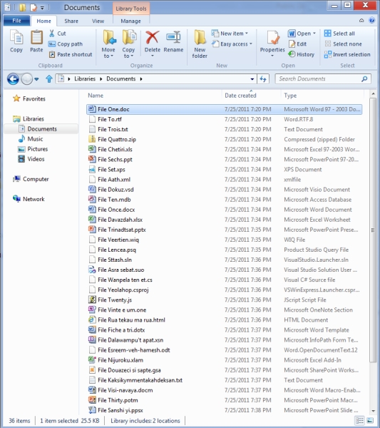
Having explored the different options, it has been concluded that adopting the ribbon will deliver an Explorer interface that is optimised for file management tasks, puts frequently used commands in an intuitive and easy-to-find location and, above all, brings back many requested features from the Windows XP era - thereby respecting Explorer's heritage.


HEXUS Forums :: 63 Comments

Login with Forum Account

Don't have an account? Register today!
I'm sorry, but that screenshot makes it look absolutely dreadful. Can someone explain to me why simple filer windows need *that* many buttons and wasted real-estate?

Sorry to be the party pooper!
Irien
I'm sorry, but that screenshot makes it look absolutely dreadful. Can someone explain to me why simple filer windows need *that* many buttons and wasted real-estate?

Sorry to be the party pooper!

It's the Windows 8: Finger Friendly Edition. You can collapse and hide the ribbon if you don't need it.
Oh dear God, please don't take anything from Office 2007+!!!

Let's take these handy, useful, easy to find buttons and bury them deep in a menu in a totally illogical place! “More intuitive” my arse!

It's still amusing to plonk down an experienced Office user in front of 2007 for the first time and ask them to open, modify, print, save and close a document. Yes, the shortcuts still work, but no, that's not more intuitive!

Oh dear, I've digressed again with a rant…
Looks good to me and a nice step forward for any person that is not too confident with using explorer/file manager.
Roobubba
Oh dear, I've digressed again with a rant…

Yes, you have ;)

People - READ the blog carefully, watch the video - MS have gone to great pains to point out that nothing is lost - in fact you can see more files and they're focusing on providing lots of functionality for power users as well as the general user. They back up their post with real world stats if you read what's posted. It'd be nice if people posted objections having read and thought about the article - and constructively at that!

Sadly most people just looked at the screenshot and not the MS blog which gives you massive insight to how they got there (and it does make a lot of sense). Hexus are partially to blame as most people won't bother to follow the click through before commenting. People naturally fear change sadly.

Irien
I'm sorry, but that screenshot makes it look absolutely dreadful. Can someone explain to me why simple filer windows need *that* many buttons and wasted real-estate?

Sorry to be the party pooper!

Yes, MS can - read the blog!