


Site for sore eyes
Google his updated its Sites service for mobile devices, optimising pages created using the service for small displays, should users wish to enable the feature.
The changes aren't especially major, but they should offer a better experience for mobile visitors to websites created on Google Sites. The most noticeable changes, says Google, are as follows:
- Aligning the header layout and top bar
- Fitting the width of the site to match the device's width
- Smart handling of sidebars, horizontal navigation, and dropdown links
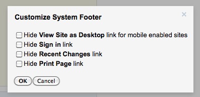
It's also possible to hide a number of footer links, which are less likely to be used by mobile visitors, saving some space.
The new option is enabled from the Sites management page, and offers a preview mode so developers can see how their site will look to mobile visitors. Currently the optimised layout is only enabled for iOS 3 and Android 2.2 (or newer) users, leaving those with outdated handsets, and of course Windows Phone 7, out in the cold. However, given the low number of people using those operating systems, that's hardly a major problem.

Google has also added new mobile-friendly versions of its sites lists, sites search and sites browse categories, making the entire Sites network easier to browser on a phone, or tablet, in addition to individual pages. While Sites isn't one of the best-known Google properties, it's still good to see mobile users being put at the forefront of Google's development, especially as a growing number of Internet users are turning to their mobile devices as their primary browsing tool.