The user-interface for the upcoming version of Microsoft's Internet Explorer has been a closely-guarded secret, even being removed from developer builds released earlier this year. The company was probably hoping that the browser's new look would remain that way until the September 15 beta launch-event, but it seems that it may have been revealed a little early.
ZDNet's Mary-Jo Foley managed to grab a press-photo from Microsoft's Russian website that appears to show-off the revised interface.
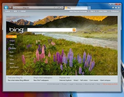
IE9 seems to be taking a minimalist approach in a similar vein to Google's Chrome and the latest beta of Mozilla Firefox. The window is bereft of menus, bookmarks and toolbars with all of the controls being grouped into buttons in the top right corner. The only exceptions are the forward and back buttons that sit in the top left corner, next to the address bar.
Talking of such, the address bar has been combined with the search box, again mimicking Chrome. Rounding out the interface are the tabs, which have been squeezed alongside the other controls, instead of being given their own row. While this could make the interface quite cramped for those with a lot of tabs open, it will help users with limited screen real-estate - such as netbook owners - by giving the actual page more space.
Foley managed to grab a few other morsels of information from the site as well. The new browser will include the ability to ‘tear' tabs from one window into another and what sounds like the ability to pin websites directly to the Windows 7 taskbar.
The page has since been pulled, so we can't verify the details for ourselves. However, we will know more after Microsoft's beta launch-event, which is now less than three weeks away.