


The all-new taskbar
The taskbar as we know it first came about in Windows 95, and has since been given minor upgrades to enhance its appearance and functionality.
In Windows 7, the taskbar will be subject to various alterations that make it something of a mix between Apple's OS X Dock, Microsoft's Vista taskbar and a quick-launch bar.
At first glance, it appears not a whole lot has changed. The taskbar is less round than the Vista iteration, and somewhat more see-through, too. Get closer, and you'll find things to be quite different.
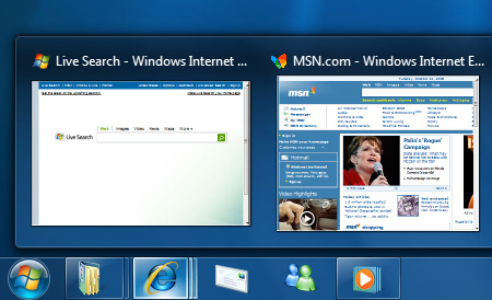
Looking at the taskbar items, you'll notice that both shortcuts and windows now reside in the same space - whereas the quick-launch area previously separated the two. It's a change that makes the Taskbar more Dock-like, but Microsoft has added visual indicators to help differentiate between items.
An icon with a border, Documents, Internet Explorer and Windows Media Player in the above example, illustrates an active window or application. An item without a border is merely a shorcut. Expanding on that visual information is multiple borders, the Internet Explorer icon shows three - highlighting that three tabs are open within the browser itself. Mouse over the icon and the visual pop-up shows all three tabs, allowing the user to click through to a specific area.
It's an interesting take on the taskbar, but the level of refinement can only be seen when in action. Mousing over any icon in the taskbar will tint the icon's background to a unique colour - which specific colour is calculated by dynamically abstracting the most dominant RGB value of the application icon. For example, the Media Player icon is likely to tint orange and the Internet Explorer icon will no doubt turn blue, and so on.
It's certainly pretty, but what about functionality? Users will note the lack of text description, so what about multiple windows? We're told that text descriptions can be turned on, but if you prefer the icon-only style, you'll be taking advantage of a new feature called Jump Lists. Right click on a taskbar icon and you're presented with a Jump List that lists the windows or documents currently open. In specific apps the Jump List will provide additional easy-access controls such as media playback in Windows Media Player.
Another taskbar first is drag-and-drop functionality. Users will at long last be able to rearrange taskbar items to their heart's content, and there's even multi-monitor support.
The taskbar, then, has been heavily refined. How about the notification area and start menu?


