This here image, is one of many created by deviantART user, xazac87. Looks kinds cool, doesn't it?
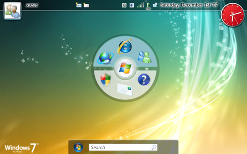
Sadly, it isn't a screenshot of Microsoft's 2010 operating system, Windows 7. It is, in fact, just one of many concept images created by xazac87.
That, however, hasn't stopped the various images from circulating the web quicker than a Windows pirate-copy. Tech website, CrunchGear.com, goes as far as to state:
"We can confirm these are indeed screen shots of the current build of Windows 7 as it will be introduced in 2010, but keep in mind that’s three years away and many changes might be made. We’re hoping it’s better than Vista."
The images seem to have been picked up first by the Winners of Life blog, and then found their way to PC World Australia, who provided the headline "Windows 7 screenshots leaked". Similarly, TechCrunch.com states "we've confirmed that this is what the current build of Windows 7 looks like".
Though certain websites may have gone a step too far by claiming to have confirmed the authenticity of these images, we're well aware that everybody, including HEXUS, will now be doing their utmost to secure exclusive Windows 7 details.
Nonetheless, now that Microsoft has lifted the lid on Windows 7, you can expect to be flooded with information over the coming year and a half. Our caution is simply to be wary of everything you read, Microsoft is keeping Windows 7 details under wraps, and supposed "leaks" might not be what they seem.
Still, isn't it fun how the interweb goes crazy at the mere hint of potential Windows 7 screens? If you'd like to see more of xazac87's Windows 7 concepts, head over to deviantART.com.